
FREE TO USE, WITH LIMITS
The regular Power BI product is free to use. You have 1GB of storage for data. You can update your reports with new data once per day. If you build so many reports that you exceed the 1GB limit, you can upgrade to Power BI Pro for $9.99 per user per month. The Pro version offers 10GB of storage per user, and data can be uploaded once per hour instead of once per day.
Microsoft’s goal with this approach is to make it very easy to start exploring data. The company is convinced that once you see what’s possible with Power BI, you’ll find enough uses to subscribe to the Pro plan. The pricing is extremely competitive. The cost of Tableau—the data visualization that Microsoft seems to be competing with here—usually begine at four figures per user.
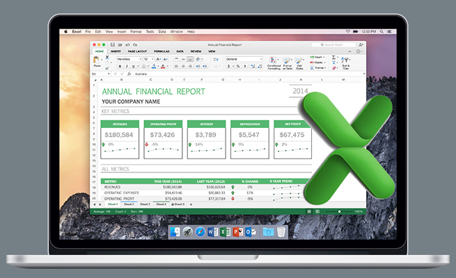
POWER BI DESKTOP AS A DESIGN TOOL
There are two distinct components to the product: Power BI Desktop is a design tool that runs on your Windows computer. You can use the tool to import Excel data sets, create relationships, and then build a dashboard report using a variety of charts.
In addition to connecting to Excel, you can connect to 60 other data sources. Microsoft has built connectors for services such as Google Analytics, MailChimp, Marketo, Microsoft Dynamics, Oracle, Quickbooks Online, and SalesForce.
You can even combine data from different sources. Maybe you download data from Oracle but then need to use VLOOKUPs to add additional columns from Excel tables. You can define the relationship once using the Get & Transform tools in Power BI Desktop. Every time you click Refresh, Power BI will go back to the original data source, load new data, and then do the VLOOKUPs again. It will be familiar if you’ve experimented with the Power Query add-in in Excel 2010-2013 or the Get & Transform tools in Excel 2016—all of those features are built into Power BI Desktop.
BETTER CHARTS THAN EXCEL
While Excel 2016 offered a few new chart types, the bulk of Excel charts look the same as they did in Excel 97. The charts in Power BI are fresh. There are a number of new built-in chart types included, but the best part is that Power BI has an open-source interface where anyone can design new chart types. There are dozens of interactive chart types that you can download and add to your dashboard.
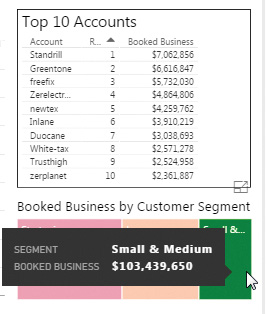
All of the charts in your report can be connected and interactive. If you click on the West region in Chart 1 of your report, the other charts in the report can update to show only data from the West region. You can also define hierarchies: If someone double-clicks on the West region, the chart can drill in and become a report showing California, Oregon, Washington, Arizona, and Nevada. Click the “up” icon to move back up to the chart showing all regions.
Figure 1 shows a dashboard with three different customer segments in the lower right. When you click on the green Small & Medium customer segment (see Figure 2), all of the other reports update to show only results from that segment.

DESIGNED FOR TOUCH
Power BI offers an app for Android and iOS devices. Provide a sign-in and password to your data, and someone will be able to interact and explore your dashboard on their iPad or Android tablet. Power BI does a good job of resizing and rearranging your reports so they fit on the smaller screen of a tablet.
While it seems unlikely that you’ll ever be able to port your VBA macros to Excel running on an iPad, the interactivity offered by Power BI would allow your management team to see refreshed metrics on a regular basis—daily if using the free Power BI, or hourly using Power BI Pro.
GETTING STARTED
To get started with Power BI, go to https://powerbi.microsoft.com and sign up for a free account with an email address. Using the Learn tab, you can see how to build your first dashboard in a couple of hours.
Also, take a tour of what’s possible by browsing sample dashboards such as the Elizabeth Glaser Pediatric AIDS Foundation dashboard at www.pedaids.org/dashboard.

October 2016

